Design trends come and go, a bit like fashion.
At the moment, one of the prevailing styles seems to be light text on dark backgrounds. On screen it can look clean and modern. Used well, it is perfectly readable too.
But sometimes design choices are made with the screen in mind and not much thought for what happens next.
The dark background problem
A good example appeared in my inbox recently. I was getting ready for attending the ServiceNow AI Summit and, as with many events, the organisers published the agenda as a graphic on their website.
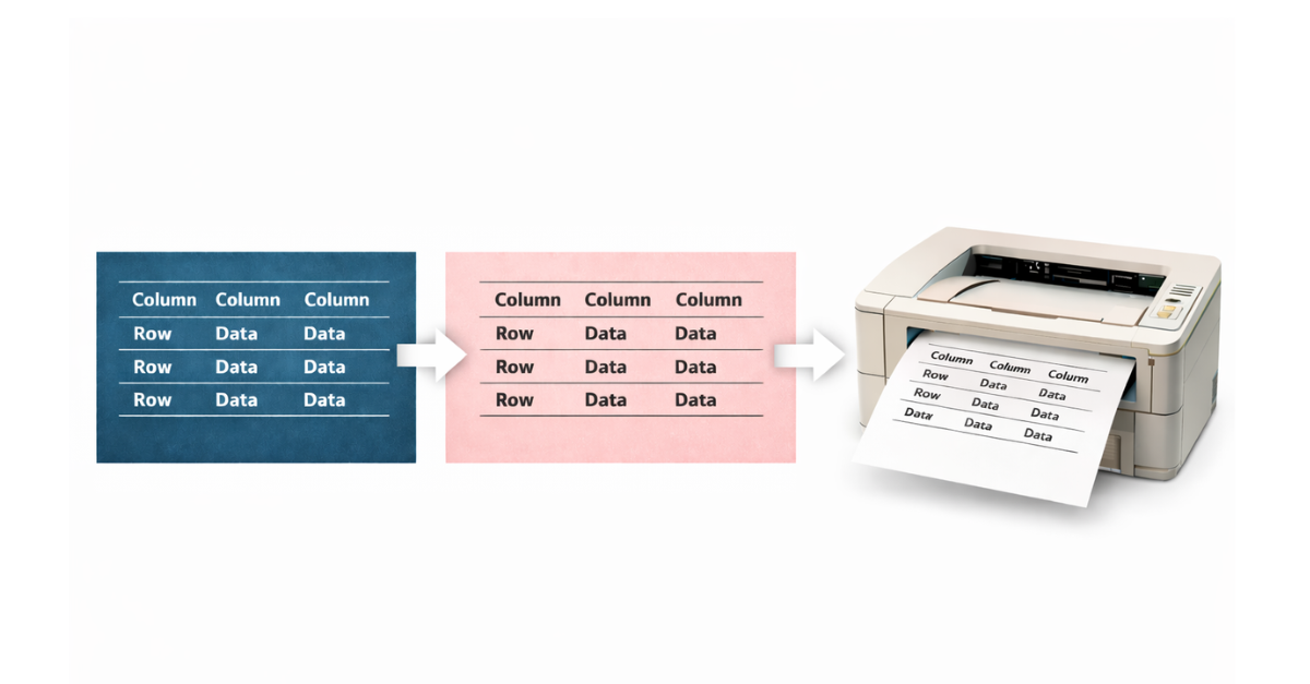
That is already not ideal from an accessibility perspective. Text embedded in an image is not searchable, scalable, or friendly for screen readers.
There is also a practical problem because the agenda uses light text on a dark background. That looks fine on screen, but becomes less practical if printed.
Suddenly you are printing what is essentially a large black rectangle with white text on top. Toner disappears quickly. And if you are like me, the printer available is a perfectly serviceable black and white laser device. Great for documents. Less good for printing a mostly black page.
A slightly odd workaround
So, I took the agenda graphic and inverted it, creating a negative version which had dark text on a light background. On screen it looks dreadful, but on paper it works perfectly well.
More importantly, it doesn’t try to empty the toner cartridge in one go.
It is a small example of what happens when something is designed purely for screens without thinking about what people might do next.
Why print it at all?
You might reasonably ask why I printed the agenda.
Because I wanted to plan my day and, without an event app, I took the analogue approach. I printed the schedule and started circling sessions, and scribbling notes.
It is simple, quick, and surprisingly effective because paper is still a very good interface for thinking.
Of course, I could probably solve this with an iPad and a stylus. But that feels like rather a lot of electronics just to draw circles around a agenda items. A pen and a sheet of paper works perfectly well.
Design for how things are used
None of this is really about dark backgrounds. They can work very well in the right context.
The issue is when design is optimised for appearance rather than use.
And the problem is not limited to conference agendas. I’ve seen similar with airline boarding passes surrounded by dark-coloured ads on an A4 PDF. I’ve also experienced event tickets made available in PDF format but using dark designed graphics.
If something might reasonably be printed, a print-friendly version helps. If something contains structured information like a conference agenda, publishing it as text instead of a graphic helps even more.
And if a design choice accidentally turns a simple print job into a toner-consuming black rectangle, that is probably a small sign that the design process has drifted a little too far from real-world use.
Sometimes the most useful design choice is simply remembering how people actually use things.